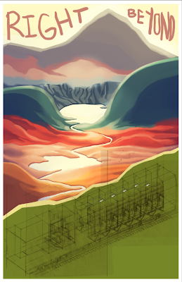
Here is the comp of the cover for my train story. I think doing this iso train drawing is going to be more difficult than the house because I'm going to include people. But at least I only had to draw the roomette in pencil once...photoshop is my lover. Still, drawing a whole bunch of different folks is going to be a pain. How does Darrow do it??
 Last night I found out that everyone but me has seen Electroma. Apparently it's pretty terrible.

I dunno man, looks pretty great to me.
I like the title, and the cover looks great so far. Looking at it right now, you might have a problem not letting the train be overwhelmed by the landscape in the background. It's just an idea, but is there a reason why the iso needs to be the cover? What if the cover were a simpler representation of the train, and the iso were the first spread, introducing the characters and environment? It would be a shame to lose detail down there in the bottom half of the cover.
ReplyDeleteThis cover is looking great. The iso train is going to look really great in contrast to the more loosely rendered landscape behind. But I agree with Seth that the train may become overwhelmed being on the bottom half of the page. One solution could be to move the train a little higher on the page, so the top of the train crests over the green mountainside, forcing the landscape further into the background. The colors are looking really nice too. What is this story about? The one character that you drew looks a lot like you. Intentional?
ReplyDeleteErica